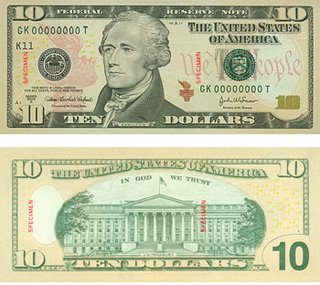
They did it again!

First the $20, then the $50 and now they have tinkered with the $10.
I have not been a big fan of this current redesign. I have found it minor and inconsequential. Designed by bureaucrats and people unaware of good design and the power of it.
Perhaps I am a little bias, spending the better part of a year writing a thesis about currency design and how it can brand a country, and then meeting another from India who also wrote an interesting paper about the power of money and what it says about national identity, but I just wish our country would come out and make a powerful stand in the design if what is commonly known as "international currency."
But here I find myself, a little more impressed than I have been with one certain element on the new $10. On the face side to the right of Hamilton's portrait are the words "We The People." Finally, words of meaning. Words everyone understands. Words that start to express our BRAND as a country. What makes our country so unique and desirable to everyone everywhere? WE THE PEOPLE. Our freedoms. Our opportunities.
In 1999, when the US was going to begin this redesign process, ID magazine asked several designers how they would redesign the $20. Jennifer Sterling and Eric La Brecque, San Francisco, chose a unique approach to explore a theme more central to our national identity, words. Be it the inscription on the Statue of Liberty, the words of the Declaration of Independence or even the Constitution. These words endure. As Jennifer said "It makes sense to move away from the cult of presidents and move toward a cult of texts.
I could not agree more.
WE THE PEOPLE


1 Comments:
I agree. The redesigns have seemed trite. Was there a way to make our currency stand out more as opposed to looking like a colony? I dinno.
thanks for the post ... I hadn't seen it yet.
Post a Comment
<< Home